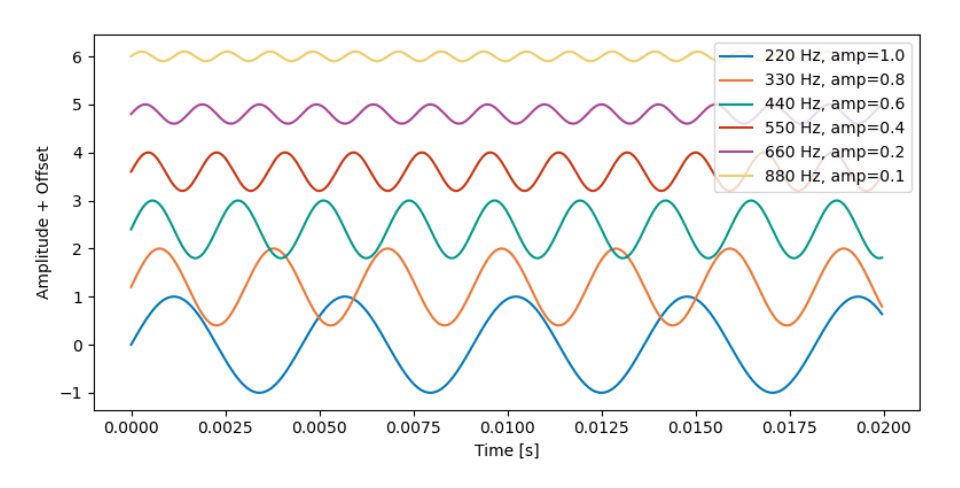
Alt text (alternative text) is a concise textual description of an image, graph, or figure that allows screen readers to convey the essential visual information to people who cannot see or perceive the content. Here are some guidelines and practical tips for creating effective alt text; learn more here.
- Keep it concise, but complete: Focus on the essential information that the image conveys (e.g., trends in a graph, structure of a diagram). Avoid lengthy repetition of what is already described in the main text or figure caption.
- Focus on meaning, not purely visual details: If the figure is meant to show the comparison of two algorithms, emphasize their performance difference rather than purely stating "blue bar, red bar."
- Use consistent terminology: Match the style and terminology used in the main text. Expand acronyms at least once if they are not explained elsewhere.
- Avoid "image of..." phrasing: Since screen readers already identify the element as an image, you can skip phrases like "This is a figure of ..." and go directly to describing the content.
- For complex images, provide a short alt text plus a longer explanation (if needed): If a graph or chart is very detailed, include a brief alt text describing the main takeaway, and put a more thorough explanation (e.g., data points or methodology) in the main text.
- Mark decorative images: If the figure is purely decorative (adds no new information), mark it as decorative (in Word) or set it as an artifact (in Acrobat) so screen readers can skip it.
Below are some common ways to add alt text to your final manuscript:
1. LaTeX (TeXLive 2024)
1. Ensure you are up to date with the latest version of LaTeX (2024). You can check your current version via the command line:
latex --version2. Install the tagpdf package:
sudo tlmgr install tagpdf
3. Add the following line as the first (non-comment) line in your TeX file (e.g., above \documentclass{article} in the ISMIR2025_template.tex file):
\DocumentMetadata{testphase={phase-III,activate=tagging}}(This activates the tagging feature for accessible PDFs.)
4. Ensure that the graphicx package is included:
\usepackage{graphicx}(This is already included in the ISMIR template.)
5. Add alt-text to any images as an optional alt={...} argument to any \includegraphics commands. For example:
\centerline{\includegraphics[alt={ISMIR 2025 template test image},width=0.9\columnwidth]{figure.png}}Note: Avoid spaces between optional arguments. Replace the text in alt={...} with a short, meaningful description of your image.
2. Adobe Acrobat
- Follow the instructions here to add or edit alt text in Adobe Acrobat. After generating your PDF (from Word or LaTeX), open it in Acrobat and use Tools > Accessibility > Reading Order (or "Set Alternate Text") to review and set the alt text for each figure.
- If an image is purely decorative, you can mark it as a background/artifact so that screen readers skip it.
- Consider running an Accessibility Check (Tools > Accessibility > Accessibility Check) to ensure all figures have appropriate alt text.
3. Microsoft Word
- Follow the instructions here to add alt text in Microsoft Word.
- After inserting an image, right-click > "Edit Alt Text..." and provide a short, meaningful description. If Word suggests an auto-generated description, review and replace it with your own text to ensure accuracy.
- Use Word's built-in Accessibility Checker (Review > Check Accessibility) to verify that all images have alt text.
- Mark purely decorative images as "Decorative" so that screen readers skip them.

